If you were in Brisbane anytime of the past few months, you definitely could not have said “Gilimbaa, I’ve never seen any of their work”. This hard-working and talented team’s signature style has adorned Brisbane’s cityscape in readiness for this significant international event.
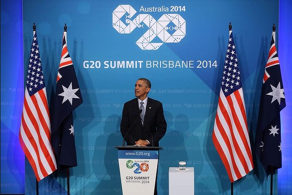
The G20 logo was designed by Gilimba with the artwork created by Indigenous artist Riki Salam. The logo represents a weaving together of nations, a gathering of leaders and the journeys they will embark upon throughout 2013-14. The triangle shapes represent the members, invited guests and international organisations that attended the G20.
About the logo, Gilimba says,
The logo pays tribe to Australia’s Aboriginal and Torres Strait Islander population and their ancient cultures. It is inspired by the traditional Torres Strait Islander weaving pattern of the Coconut Palm leaf. Connecting shapes, representing the Aboriginal Rainbow Serpent legend, form a track through the discussions and events of the host year and reflect the G20 journey. The weaving also forms a fish which represents the Dhari, a traditional Torres Strait Islander headdress. The fish is a reminder of the connection between people and the sea – the source of life and food. The colours represent the diverse landscape of Australia from red desert sands to golden beaches and lush tropic rain forests, and economic sectors such as resources, infrastructure and manufacturing.
Congratulations to Gilimbaa on an job well done. We look forward to seeing more great work from Amanda, David, Riki and the rest of the team well into the future.